ParknShop Website Checkout Revamp
Revamping ParknShop website was one of my main job in my years in ASW. Our team did a series of UX workshop including card sorting, online surveys, user test interviews, usability tests etc. to make sure our product matches our users’ needs.
Prototype
〰️
Usability test
〰️
Report
〰️
UX improvement
〰️
Prototype 〰️ Usability test 〰️ Report 〰️ UX improvement 〰️
A.S. Watsons Group, 2019-2020

Me conducting usability test.
Brief
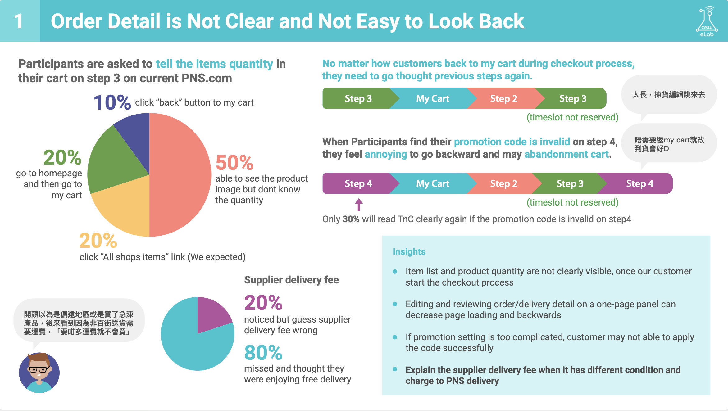
PARKnSHOP’s old checkout process had four steps in four different pages, we found a significant number of cart abandonments and high exit rate.
Outcome
We simplified the process by designing a one-page checkout, where users can edit carts, check stock availability, apply vouchers, set up delivery time and choose payment methods on the same page.
Role
I was responsible for the UX/UI process: prototyping with the help from developers to get a functional HTML so as to gain accurate feedback from the usability test, interviewing participants in the usability tests with support from an UX researcher, designing high fidelity layouts after we gained insights.
—
Usability Test
collecting Users’ thoughts
As one of the facilitators, we interviewed 10 participants, they were in different age groups and backgrounds, some of them are our royal customers, some of them only shopped at us once, some of them are our competitors’ customers! We created a new design of the checkout page and coded it with HTML for the test.


During the test, we asked the participants to perform the same tasks with both the current and new designs, and speak their thoughts out loud. Some of them tested with desktop, some of them tested with mobile phone.
The whole interviews were recorded with screen-recording or a camera. An observer were taking notes at the same room.
—
We put together a report with problems we found and insights we have gained. The tests proofed our new designs work as expected, with some twist to be made.


—
High-fidelity Designs
—
Before and after
Thoughts
These usability tests were time consuming, I am glad we had the budget to do so. Later on, we had feedback from some stakeholders saying our questions were a bit misleading as they were to proof our new designs worked, I think we could be more open-ended by asking ‘What are you thinking?’ instead of ‘What do you think?’.
One thing I learnt is we should have done debriefing right after a test, when we still had our fresh minds, as we re-watched the recordings to capture the actual saying from the participants, which could have been avoided. Also, the time we spent on organising notes was so long.
Overall it was a great experience, we not only knew what to fix for the website but also gained the overall feelings towards the company that we can feedback to the marketing team.