R&D: Design System Creation
As the lead UX designer at DRPG, I'm dedicated to supporting my team and encouraging innovation. I have created a library of reusable components and documented them. It frees up valuable time for creativity and collaboration for the team.
Pattern library
〰️
System design
〰️
UX best practice
〰️
Design system
〰️
Pattern library 〰️ System design 〰️ UX best practice 〰️ Design system 〰️
2024


Background
While designing a product for a client, I created lots of components with their UX best practices. There’s a need to organise and document them into a design system. I see the benefit of it not only keeping my product consistent but also saving it as a Library on Sketch, my team members can also use it for other projects, which will save them lots of time from scratch. I used some Research and Development time to produce this design system guideline by using Axure.
—
Challenges
The careful thinking process was the key to design UI components with best practices that would fit to the product. For instance, when I was designing this duration stepper, I knew that it is mainly used for session duration when building an agenda. From just the look of the design, developers may think it will be 1 value increase or decrease when the steppers are clicked. But for the real use case, it will be annoying for a user as it is less likely to have a session last for 1 hour 23 mins for example, it will always be 5, 10, 15 mins and so on.
To make this clear, I wrote down the behaviour of this duration stepper, stating the minute steppers should allow user to increase and decrease 5 mins unless specified. Also, the value of the hour and minute fields will not affect each other, our users are not doing maths here, they will just simply click to set the hours, and then the minutes.
Attention to details, understanding our users’ needs and communication are crucial, all the decisions need to be clearly documented so we have the one source of truth to refer to as a team.

—
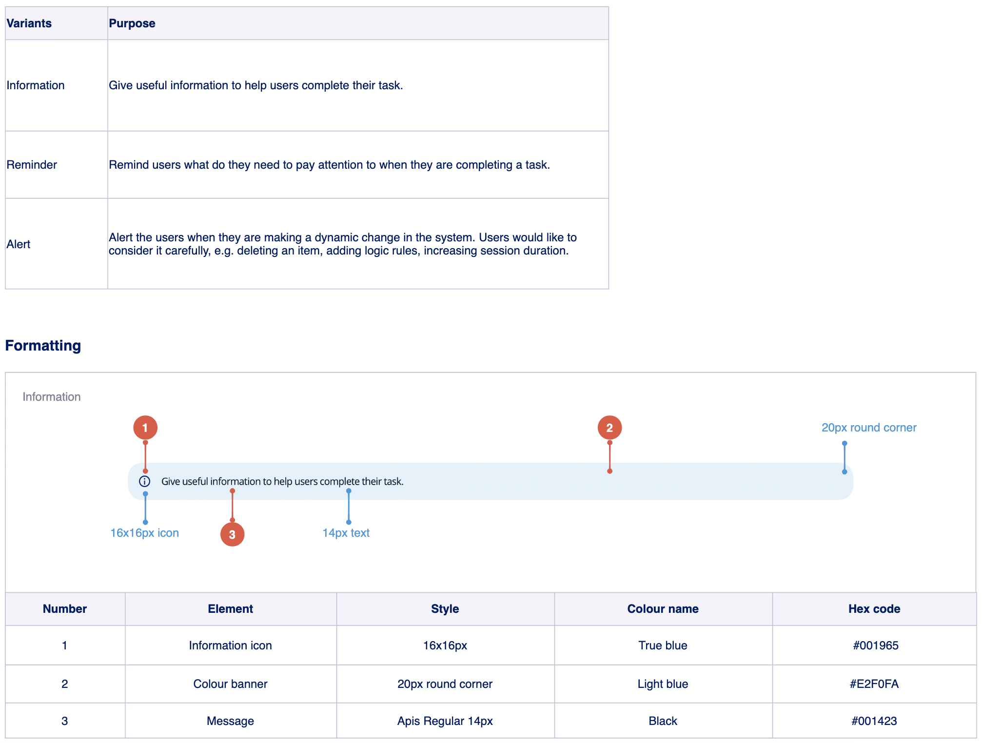
Variants
I marked the purposes of each variant of a component. Take this message banner as an example, different colours and icons mean different level of ‘warning’ to the users. I stated it clearly on a table, so who ever use this component can choose the right one to use.
—
Where to use
Documenting where to use is important too. For instance, this pagination is usually used on data table, I put a link there so we can always have examples to follow.

Thoughts
Creating and maintaining a design system is a long process, it could be boring sometimes as there are so much to do, but this is a valuable guide to keep our product consistent and behave in the best practices. This is not a one-person job, developers need to get involve to make sure things happen.
When I was working on this, I love taking ideas from Carbon Design System and Material Design. Their design systems are beautifully documented, not just visually good looking but very detailed and informative, and easy to navigate.